CSS Themes for NativeScript Apps
NativeScript’s styling infrastructure makes it possible to create and use CSS themes for your native applications, much like you would use a framework like Bootstrap on the web.
The NativeScript project provides a core theme that you can add to any of your projects. The theme includes two color schemes, light and dark, as well as a series of convenience class names to help you build elegant user interfaces quickly.
Installation
All official NativeScript templates come with the NativeScript Core Theme prepackaged and ready to go, so manual installation is unnecessary. If for some reason you’re using an app that doesn’t have the theme pre-installed, you can add it with the following command:
npm install @nativescript/theme --save
Your app.css file then needs two
@import CSS rules to include the theme in your app,
which you'll learn about in the next section.
Note: NativeScript 6.2 shifted to using scoped packages while deprecating the old packages(e.g., the
tns-core-modulesis now published as the scoped@nativescript/core). The previously knownnativescript-theme-corepackage is now published as the scoped@nativescript/theme. The new@nativescript/themeintroduced several breaking changes related to installation and usage (imports, classes, etc.). A detailed migration guide can be found here. In case you need information on how to use the oldnativescript-theme-core, refer to this article. If you prefer to use the old classes with@nativescript/theme, then you could use the compat styling.
Color Schemes
The NativeScript core theme comes with a default color scheme that supports light/dark modes (for both Android and iOS) by design.
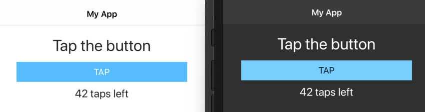
Note: The dark mode support was introduced natively with Android 10 and above and with iOS 13 and above.
CSS Imports
To use the default color scheme (with accent color blue), add
the following lines of code to the top of your
app.css file:
@import '~@nativescript/theme/css/core.css';
@import '~@nativescript/theme/css/default.css';
You may want to alternatively use one of the 11 other color
schemes included in the NativeScript core theme. To do so,
switch the second import in your
app.css file to use one of the following imports.
@import '~@nativescript/theme/css/aqua.css';
@import '~@nativescript/theme/css/blue.css';
@import '~@nativescript/theme/css/brown.css';
@import '~@nativescript/theme/css/forest.css';
@import '~@nativescript/theme/css/grey.css';
@import '~@nativescript/theme/css/lemon.css';
@import '~@nativescript/theme/css/lime.css';
@import '~@nativescript/theme/css/orange.css';
@import '~@nativescript/theme/css/purple.css';
@import '~@nativescript/theme/css/ruby.css';
@import '~@nativescript/theme/css/sky.css';
SASS Imports
To load SCSS with
@nativescript/theme, the imports are as follows.
@import "~@nativescript/theme/core";
@import "~@nativescript/theme/blue";
The files are now located in the root of the theme package as
opposed to nativescript-theme-core, where they were
in a particular scss folder.
Compatibility Imports
If you prefer to use the old classes for styling(from
nativescript-theme-core), you can import the
.compat core theme and skin to do so.
CSS compatibility imports
@import "~@nativescript/theme/css/core.compat.css";
@import "~@nativescript/theme/css/blue.compat.css";
SCSS compatibility imports
@import "~@nativescript/theme/core.compat";
@import "~@nativescript/theme/blue.compat";
Note: This image shows all 13 color schemes on iOS and Android, and can help you decide which color scheme is a good fit for your app.
Class Names
The NativeScript core theme contains a wide variety of CSS class names you can use to style your applications quickly. Here’s a complete list of the class names and what they do.
Headings
The following heading class names can be used to create
headings, much like you would use <h1> or
<h2> elements on the web.
h1h2h3h4h5h6
Here are a few examples of how you could use these class names.
<Label class="h1" text="This is a big heading"></Label>
<Label class="h6" text="This is a small heading"></Label>
Text
Several utility class names are available for changing the display of text you use in your applications. Here’s what they do.
-
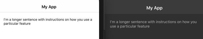
body: A class name for long-form content in your apps, such as paragraph text.
<Label class="body" text="I’m a longer sentence with instructions on how you use a particular feature" textWrap="true"></Label>
-
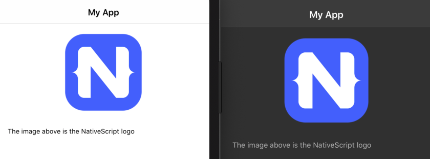
footnote: A class name that decreases the text size of a given UI element. Useful for footnotes that describe images or other features in your apps.
<Image src="https://preview.nativescript.org/dist/assets/img/NativeScript_logo.png" width="150" class="m-b-30"></Image>
<Label class="footnote" text="The image above is the NativeScript logo"></Label>
-
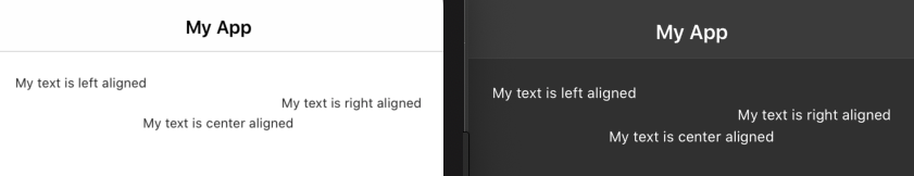
text-left: A class name that appliestext-align: leftto a UI element. -
text-right: A class name that appliestext-align: rightto a UI element. -
text-center: A class name that appliestext-align: centerto a UI element.
<Label class="text-left" text="My text is left aligned"></Label>
<Label class="text-right" text="My text is right aligned"></Label>
<Label class="text-center" text="My text is center aligned"></Label>
-
text-lowercase: A class name to lowercase all characters in the text of a given UI element. For instance,<Label class="text-lowercase" text="HI">will display as “hi”. -
text-uppercase: A class name to uppercase all characters in the text of a given UI element. For instance,<Label class="text-uppercase" text="hi">will display as “HI”. -
text-capitalize: A class name to uppercase the first letter in the text of a given UI element. For instance,<Label class="text-capitalize" text="hi">will display as “Hi”.
Font
The NativeScript core theme does not change the base font family you use to develop your apps; however, the theme does provide a series of font-related class names.
-
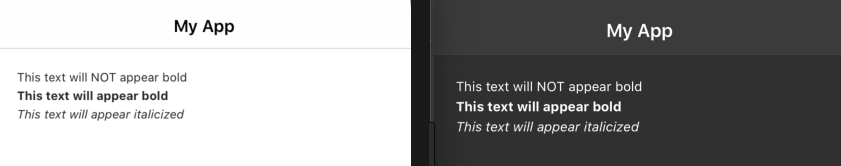
font-weight-normal: A class name to display a font in its normalfont-weight.
<Label class="font-weight-normal" text="This text will NOT appear bold"></Label>
-
font-weight-bold: A class name to display a font in its boldfont-weight.
<Label class="font-weight-bold" text="This text will appear bold"></Label>
-
font-italic: A class name to display font in italic text.
<Label class="font-italic" text="This text will appear italicized"></Label>
Padding and Margin
Several class names are available to control the spacing of UI components within your application. The first set of class names allows you to add margin or padding to a given UI component quickly.
The class names follow a convention of
margin/padding -
top/bottom/left/right - amount. So for
example, <Button class="m-t-2"> renders a
button with a margin-top of 2, and
<Button class="p-b-5"> renders a button with
a padding-bottom of 5. Below is a full
list of the class names available, along with the rules that
they output.
Note that for each of these rules the “m” can be swapped with a
“p” to apply padding, and that these rules are available for the
values of 0, 2, 5, 10, 15, 20, 25, 30; therefore,
m-r-0 and m-r-2 are valid class names,
but m-r-8 is not.
m-0={ margin:0 }m-t-0={ margin-top:0 }m-r-0={ margin-right:0 }m-b-0={ margin-bottom:0 }m-l-0={ margin-left:0 }-
m-x-0={ margin-right:0; margin-left:0 } -
m-x-auto={ horizontal-align: center } -
m-y-0={ margin-top:0; margin-bottom:0 }
Dividers
A divider is a common way to separate areas of your user
interface. The NativeScript provides two class names that can be
applied to empty <StackLayout> elements to
create a simple divider with a height of 1.
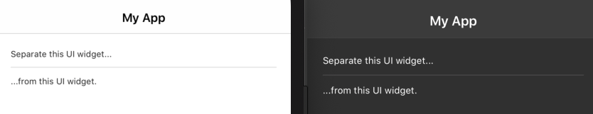
-
hr: Creates a colored divider (will vary depending on the chosen light/dark mode).
<Label text="Separate this UI widget..."></Label>
<StackLayout class="hr m-10"></StackLayout>
<Label text="...from this UI widget."></Label>
Utilities
The NativeScript core theme provides a set of utility class names that can be applied to UI components in your application.
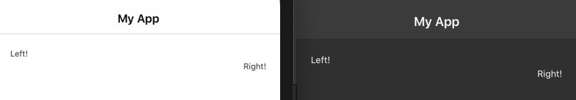
-
pull-left: A class name to pull text to the left-hand side of its container. -
pull-right: A class name to pull text to the right-hand side of its container.
<StackLayout>
    <Label class="pull-left" text="Left!"></Label>
</StackLayout>
<StackLayout>
    <Label class="pull-right" text="Right!"></Label>
</StackLayout>
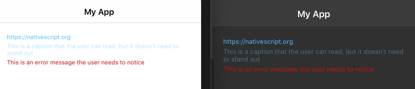
Contextual Colors
You can convey meaning through color with a handful of utility classes that are included in the NativeScript core theme.
-
text-primary: A class name that makes text appear active or clickable. -
text-muted: A class name that makes text appear subdued, such as captions or informational messages. -
text-danger: A class name that makes text stand out, for components such as errors.
<Label class="text-primary" text="https://nativescript.org"></Label>
<Label class="text-muted" text="This is a caption that the user can read, but it doesn’t need to stand out" textWrap="true"></Label>
<Label class="text-danger" text="This is an error message the user needs to notice" textWrap="true"></Label>
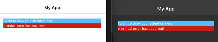
-
bg-primary: A class name that applies the theme’s primary background color. -
bg-danger: A class name that applies the theme’s danger color.
<StackLayout class="bg-primary">
    <Label text="I want to draw your attention here."></Label>
</StackLayout>
<StackLayout class="bg-danger">
    <Label text="A critical error has occurred!"></Label>
</StackLayout>
Element Selectors
The old nativescript-theme-core was using specific
CSS classes that the user had to add on every element to get it
styled. The new @nativescript/theme takes a very
different approach - all elements are styled by default using
Element selectors (like
ActionBar or RadListView for instance)
and adding classes is not required. This brings us to something
you may hit along the way - since all elements are already
styled, you may need to override some of their stylings. And
since NativeScript doesn't support !important, you can do this
with a CSS feature called specificity (see
this article
for details).
ActionBar
The theme styles for ActionBar are applied via its
element (type) selector.
<!-- The theme styles are applied via the type selectors ActionBar & ActionItem -->
<ActionBar title="My App">
    <NavigationButton></NavigationButton>
    <ActionItem ios:position="right">
        <Button text="My Action"></Button>
    </ActionItem>
</ActionBar>
Note: In most cases, no additional CSS classes are needed for theming the NativeScript components. Still, for custom scenarios, the theme provides BEM classes.
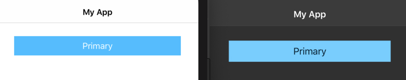
Buttons
The main theme styles for NativeScript's buttons are applied via
their element selector Button. The NativeScript
theme also includes a handful of class names to change the look
and feel of buttons in your applications.
-
-primary: A class name that applies the original color pattern of the theme to the button.
<Button class="-primary" text="Primary"></Button>
-
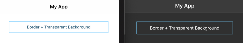
-outline: A class name that makes a button appear with a border and a transparent background.
<Button class="-outline" text="Border + Transparent Background"></Button>
-
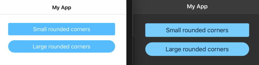
-rounded-sm: A class names that make a button appear with small rounded corners. -
-rounded-lg: A class name that makes a button appear with large rounded corners.
<Button class="-primary -rounded-sm" text="Small rounded corners"></Button>
<Button class="-primary -rounded-lg" text="Large rounded corners"></Button>
-
-active: A class name that makes a button appear highlighted when tapped.
<Button class="-active" text="I’m highlighted when tapped"></Button>
WARNING: By default, iOS uses a delay before highlighting buttons used within ScrollView controls. Therefore, use caution when applying the
-activeclass name to<Button>elements that are children of<ScrollView>s. For more details, see this Stack Overflow thread.
Forms
You can use the following form-related class names to improve the look of forms in your NativeScript apps.
-
nt-form: A class name that adds spacing to a layout container that will act as the main container for your form.
<StackLayout class="nt-form">
  <!-- The contents of the form -->
</StackLayout>
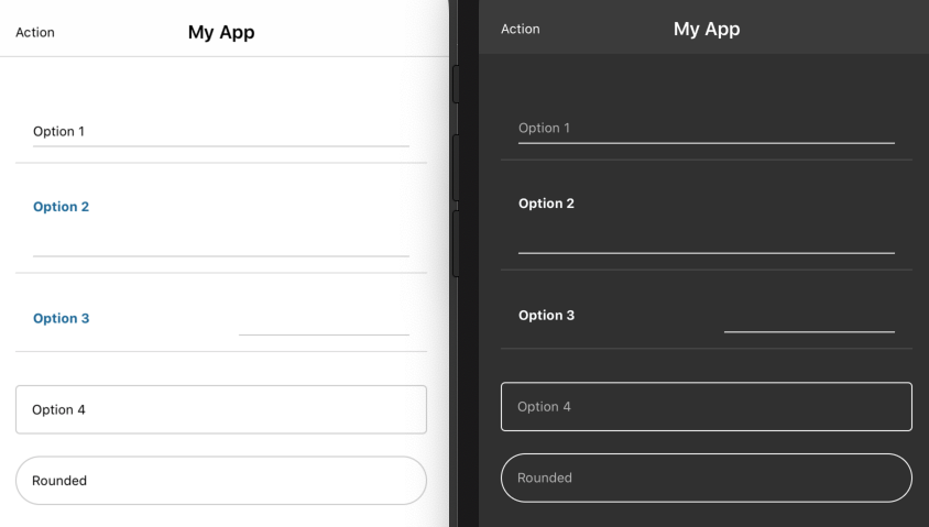
There are a few different ways you may want to display individual form fields within your form. Look over the list of class names below, and then review the following examples to see those class names in action.
-
nt-input: A class name that applies the base styling to the input block. -
-border: A class name that adds a border to a TextField UI component. -
-rounded: A class name that adds a rounded border to a TextField UI component. -
nt-label: A class name that applies the base styling to Label UI components. -
-sides: A class name that helps align a label and text field side by side.
Here’s a form with several different form control display options you can experiment with.
<StackLayout class="nt-form">
    <!-- Option 1: An input with no label, and a bottom border -->
    <StackLayout class="nt-input">
        <TextField hint="Option 1"></TextField>
    </StackLayout>

    <!-- Option 2: An input with a label on top, and a bottom border -->
    <StackLayout class="nt-input">
        <Label text="Option 2" class="font-weight-bold m-b-5" />
        <TextField></TextField>
    </StackLayout>

    <!-- Option 3: An label and input—positioned side by side -->
    <GridLayout class="nt-input -sides" rows="auto, auto" columns="*,*">
        <Label text="Option 3" class="font-weight-bold" row="0" col="0" />
        <TextField row="0" col="1"/>
        <StackLayout class="hr" row="1" colSpan="2"></StackLayout>
    </GridLayout>

    <!-- Option 4: An input with a simple border and no label -->
    <TextField hint="Option 4" class="-border" />

    <!-- Option 5: An input with a rounded border and no label -->
    <TextField hint="Rounded" class="-rounded m-t-10" />
</StackLayout>
TIP The NativeScript theme handles styling disabled TextField components. To disable a TextField, set its
isEnabledattribute tofalse. For example,<TextField class="nt-input" isEnabled="false"></TextField>.
Images
The NativeScript theme provides a few CSS class names for altering the appearance of images.
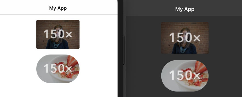
-
img-rounded: A class name that applies a smallborder-radiusto Image UI components. -
img-circle: A class name that applies a largeborder-radiusto Image UI components, making the image appear as a circle.
<Image src="https://placem.at/people?w=150" width="150" class="img-rounded m-b-20"></Image>
<Image src="https://placem.at/things?w=150" width="150" class="img-circle"></Image>
NOTE: You can only add
border-radiusto an image if it has an explicitheightandwidthset.
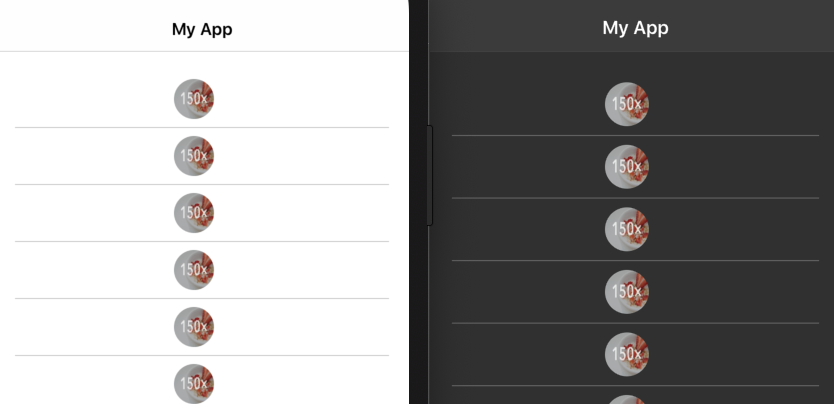
ListViews
The theme styles for NativeScript's list views are applied via
their element selector (e.g., ListView or
RadListView). Additional classes are available for
styling the cell separator lines (via
-separator CSS class) and images in the item
templates (via -thumb CSS class).
<ListView items="">
    <ListView.itemTemplate>
        <StackLayout class="-separator">
            <Image src="https://placem.at/things?w=150" class="-thumb img-circle"></Image>
        </StackLayout>
    </ListView.itemTemplate>
</ListView>
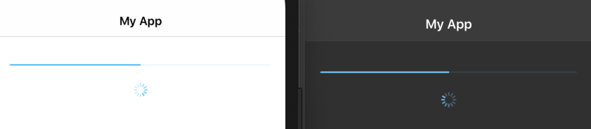
Progress and Activity
The theme styles for NativeScript's progress and activity
indicators are applied via their element selector (e.g.,
Progress or ActivityIndicator).
<Progress class="m-20" value="50"></Progress>
<ActivityIndicator busy="true"></ActivityIndicator>
SideDrawers
SideDrawers are a common way to implement navigation in your NativeScript apps. The NativeScript core theme includes class names to help you style the free-to-use RadSideDrawer .
NOTE: The UI snippets you see below should be placed within a RadSideDrawer’s
drawerContent(themed example here). Refer to the control’s documentation for more information on how to structure drawers within your apps.
-
nt-drawer__content: A class name to apply the drawer menu content styles.
Example (NativeScript Core)
<drawer:RadSideDrawer.drawerContent>
    <GridLayout rows="auto, *" class="nt-drawer__content">
        <!-- The drawer menu content follows here -->
    </GridLayout>
</drawer:RadSideDrawer.drawerContent>
-
nt-drawer__header: A class name to designate a section of your sidedrawer as the header. Useful if you want to show an image or logo above your app’s drawer navigation.
Example (NativeScript Core)
<drawer:RadSideDrawer.drawerContent>
    <GridLayout rows="auto, *" class="nt-drawer__content">
        <StackLayout class="nt-drawer__header">
            <Image src="~/assets/images/N.png" tap="" class="nt-drawer__header-image"/>
            <Label text="NativeScript Theme Project" textWrap="true" class="nt-drawer__header-brand" />
        </StackLayout>
        <!-- Drawer menu layouts goes here -->
    </GridLayout>
</drawer:RadSideDrawer.drawerContent>
-
-left: By default, the drawer menu content is centered. The-leftmodifier aligns the content to the left.
Example (NativeScript Core)
<drawer:RadSideDrawer.drawerContent>
    <GridLayout rows="auto, *" class="nt-drawer__content">
        <StackLayout class="nt-drawer__header -left">
          <!-- The header content will be aligned to the left -->
        </StackLayout>
        <!-- Drawer menu layouts goes here -->
    </GridLayout>
</drawer:RadSideDrawer.drawerContent>
-
nt-drawer__header-image: A class name to apply to an image or logo that you show within the sidedrawer header. The theme takes care of aligning the image for you. -
nt-drawer__header-brand: A class name to apply to text heading that appears in your sidedrawer’s header.
<StackLayout class="nt-drawer__header -left">
    <Image src="~/assets/images/N.png" tap="" class="nt-drawer__header-image"></Image>
    <Label text="NativeScript Theme Project" textWrap="true" class="nt-drawer__header-brand"></Label>
</StackLayout>
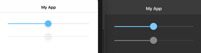
Sliders
The theme styles for NativeScript's sliders are applied via
their element selector Slider.
<Slider minValue="1" maxValue="100" value="50"></Slider>
<Slider minValue="1" maxValue="100" value="50" isEnabled="false"></Slider>
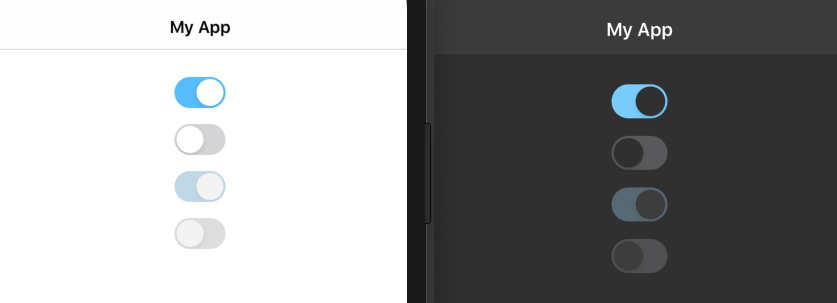
Switches
The theme styles for NativeScript's switches are applied via
their element selector Switch.
<Switch checked="true" horizontalAlignment="center"></Switch>
<Switch checked="false" horizontalAlignment="center"></Switch>
<Switch checked="false" isEnabled="false" horizontalAlignment="center"></Switch>
Tabs & BottomNavigation
The theme styles for NativeScript's tabular based components are
applied via their element selector
(BottomNavigation, Tabs and
TabView).
<BottomNavigation>
<TabStrip>
<TabStripItem iconSource="font://" title="First" class="fa" />
<TabStripItem iconSource="font://" title="Second" class="fa" />
</TabStrip>
<TabContentItem>
<HtmlView html="" class="p-20" />
</TabContentItem>
<TabContentItem>
<TextView text="" class="p-20" editable="false"/>
</TabContentItem>
</BottomNavigation>
Note: There are some conceptual differences in the way the tab based controls are looking on Android and iOS.
BEM classes
The old theme classes (from
[email protected]) are gone (except in
compat mode), but there are new classes in their place that use
a namespaced modified BEM methodology. These
are left for the cases in which you want a custom component or
for instance, Label to look like the original ones. For instance
the old .action-bar class is now called
.nt-action-bar and the old
.action-item is now
.nt-action-bar__item where nt- is
the NativeScript Theme namespace. The only difference from a
standard BEM methodology is that instead of coupling modifiers
to the blocks, in @nativescript/theme modifiers are
decoupled and start with a dash.
A list of the new blocks follows:
| Blocks and Elements | Compat (Theme v1) class | {N} Elements |
|---|---|---|
| .nt-action-bar | .action-bar | ActionBar |
| .nt-action-bar__item | .action-item | ActionItem |
| .nt-button | .btn | Button |
| .nt-label | .label | Label |
| .nt-page | .page | Page |
| .nt-activity-indicator | .activity-indicator | ActivityIndicator |
| .nt-segmented-bar | .segmented-bar | SegmentedBar |
| .nt-progress | .progress | Progress |
| .nt-slider | .slider | Slider |
| .nt-search-bar | .search-bar | SearchBar |
| .nt-switch | .switch | Switch |
| .nt-tab-view | .tab-view | TabView |
| .nt-list-view | .list-group | ListView, RadListView |
| .nt-form | .form | A group of form elements |
| .nt-input | .input-field | A block of a TextField with a Label |
| .nt-drawer | .side-drawer | RadSideDrawer |
| .nt-drawer__header | .sidedrawer-header | RadSideDrawer header area |
| .nt-drawer__header-image | .sidedrawer-header-image | RadSideDrawer header image (user thumb) |
| .nt-drawer__list-item | .sidedrawer-list-item | RadSideDrawer list item |
| .nt-drawer__content | RadSideDrawer content area | |
| .nt-icon | An icon | |
| .nt-bottom-navigation | BottomNavigation | |
| .nt-tab-strip | TabStrip | |
| .nt-tab-strip__item | TabStripItem | |
| .nt-tab-content__item | TabContentItem |
Here is a list of modifiers and where they work:
| Modifiers | Compat (Theme v1) class | Elements they Work on | What it Does |
|---|---|---|---|
| .-primary | .btn-primary | Buttons | Specifies a primary (accent colored) button |
| .-outline | .btn-outline | Buttons | Specifies an outlined button |
| .-simple | .btn-simple | Buttons | Specifies a simple (transparent) button |
| .-active | .btn-active | Buttons | Specifies activated by default button (as if pressed) |
| .-rounded-sm | .btn-rounded-sm | Buttons, TextFields | Specifies a small border radius for the element (default 4) |
| .-rounded-lg | .btn-rounded-lg / .input-rounded | Buttons, TextFields | Specifies a large border radius for the element (default 50%) |
| .-{skin} | .btn-{skin} | Buttons |
Specifies a skin accent colored button - like
.-ruby, .-forest, etc.
|
| .-border | .input-border | TextFields | Specifies a TextField with border on all sides |
| .-sides | .input-sides | TextFields | Specifies an .nt-input/.input-field with Label on the left side |
| .-left | .sidedrawer-left | RadSideDrawer header | Aligns RadSideDrawer header left (default center) |
| .-thumb | .thumb | Image in ListView | Specifies that the image should be a small thumbnail |
| .-separator | row in ListView | Adds a bottom border to a row |
SASS Usage
The NativeScript core theme is written in SASS, and you can
(optionally) use the theme’s .scss files directly.
Using SASS is a great way to customize the theme in a way that’s
not possible in CSS, such as using the theme’s SASS variables to
change your app’s appearance.
Installation
To get started, first, verify that your app has a SASS compiler
e.g., node-sass or sass (formerly
dart-sass).
npm install node-sass --save-dev
// or
npm install sass --save-dev
If using sass (dart-sass), you need to modify your webpack configuration to use that instead of default node-sass loader. In config.module.rules of webpack.config.js file you should have the following code:
{
    test: /\.scss$/,
    use: [
        "@nativescript/webpack/css2json-loader",
        "sass-loader"
    ]
}
Replace this with following code
{
    test: /\.scss$/,
    use: [
        "@nativescript/webpack/css2json-loader",
        {
            loader: "sass-loader",
            options: {
                implementation: require("sass")
            }
        }
    ]
},
Note: Webpack configuration file may get overwritten when updating
@nativescript/webpack. Use custom webpack configuration to make changes.
For a new project, you can use a template with SASS pre-enabled. A full list of officially supported templates can be found in the App Templates GitHub repository.
tns create my-new-project --template tns-template-drawer-navigation-ts
With SASS set up and ready to use, next you’ll need to import
the theme’s .scss files into your own. Start by
creating the following files in your app:
.
├── _app-common.scss
├── app.android.scss
└── app.ios.scss
After that, paste the following code into your
app.android.scss file.
// Import common styles
@import 'app-common';

// Place any CSS rules you want to apply only on Android here
And the following code into your app.ios.scss file.
// Import common styles
@import 'app-common';

// Place any CSS rules you want to apply only on iOS here
Finally, paste the following code into your
_app-common.scss file.
@import "~@nativescript/theme/core";
@import "~@nativescript/theme/blue"; // Or any other color theme (default === blue)

// Place any CSS rules you want to apply on both iOS and Android here.
// This is where the vast majority of your CSS code goes.
Custom skin using variables
As nativescript-theme-core!1.x.x before it, the
@nativescript/theme also allows customization
through SCSS variables. However, due to changing its internals
to use maps, you can change the variables only
before the rest of the theme is loaded.
app-common.scss
/* Colors */
$accent: #369;

/* This color was named $ab-background in Theme v1 */
$complementary: fuchsia;

/* The variables are loaded before the Core styles */
@import '~@nativescript/theme/index';
The code above is enough to create a custom skin with blue
accent and a pink ActionBar.
Note: When creating custom skin you don't need to import any other file than
~@nativescript/theme/indexand it should be introduced after you make changes to the variables!
Here is a list of all variables that can be changed.
| SCSS variable | Type | Default | Usage |
|---|---|---|---|
| $compat | boolean | false | Specifies that compat styling should be generated |
| $font-size | length | 12 | Initial font size in dip |
| $btn-font-size | length | $font-size + 2 | Button font size |
| $btn-min-width | length | 64 | Button min-width |
| $btn-height | length | 52 | Button height |
| $btn-padding-x | length | 5 | Horizontal button padding |
| $btn-padding-y | length | 0 | Vertical button padding |
| $btn-margin-x | length | 16 | Horizontal button margin |
| $btn-margin-y | length | 8 | Vertical button margin |
| $border-width | length | 1 |
Border width wherever it is used (buttons if
$enable-rounded is on, inputs,
.hr)
|
| $border-radius | length | null |
General Border radius, could be in px, dip, % or rem/em
(latter converts to dip), forces
$enable-rounded to true
|
| $border-radius-sm | length | 4 |
Small border radius, used for
.-rounded-sm modifier
|
| $border-radius-lg | length | 50% |
Large border radius, used for
.-rounded-lg modifier
|
| $disabled-opacity | 0 - 1 | 0.5 | Opacity of the disabled components |
| $background | color | white | Light background |
| $primary | color | 85% negative $background | Light text color |
| $secondary | color | 30% darker $primary | Light secondary text color |
| $background-dark | color | #303030 | Dark background |
| $primary-dark | color | 85% negative $background-dark | Dark text color |
| $secondary-dark | color | 30% darker $primary-dark | Dark secondary text color |
| $accent | color | #30bcff | Light main accent color (depends on {N} skin) |
| $accent-dark | color | 10% lighter $accent | Dark main accent color (depends on {N} skin) |
| $complementary | color | white | Light second accent color - used mainly for ActionBar (depends on {N} skin) |
| $complementary-color | color | 100% negative $complementary | Text color on $complementary background (depends on {N} skin) |
| $complementary-dark | color | $complementary | Dark second accent color (depends on {N} skin) |
| $complementary-color-dark | color | 100% negative $complementary-dark | Text color on $complementary-dark background (depends on {N} skin) |
Also, several variables are mapped to the theme variables to support Kendo skins or old theme vars.
| Kendo Default | Kendo Bootstrap | Kendo Material | Theme v1 | Theme v2 |
|---|---|---|---|---|
| $accent | $accent | $primary-palette-name, base hue 500 | $accent | $accent |
| $accent | $card-cap-bg | $secondary-palette-name, base hue 500 | $ab-background | $complementary |
| $bg-color | $body-bg | $background | $background | |
| $text-color | $body-color | $primary | $primary | |
| $material-dark-complimentary, base-bg | $btn-color | $btn-color | ||
| $ab-color | $complementary-color |
So now, you can export a skin from Kendo UI ThemeBuilder, get the contents of variables.scss in the skin zip file (you don't need the big CSS file in there) and easily create a skin by the same single import underneath.
$base-theme:Bootstrap;
$skin-name:indigo;
$swatch-name:Indigo;
$border-radius: 0.25rem;
$accent: #25c55b;
$secondary: #465372;
$info: #5bc0de;
$success: #5cb85c;
$warning: #f0ad4e;
$error: #d9534f;
$body-bg: #5c7091;
$body-color: #ffffff;
$component-bg: #536182;
$component-color: #ffffff;
$card-cap-bg: #465372;
$card-cap-color: #ffffff;
$series-a: #25c55b;
$series-b: #5bc0de;
$series-c: #0275d8;
$series-d: #f0ad4e;
$series-e: #e67d4a;
$series-f: #d9534f;

@import '~@nativescript/theme/index';
Loading Variables and Mixins
To load all core theme variables and mixins, you only need this import:
@import '~@nativescript/theme/scss/variables';
In addition, you can load the Theme variables and mixins for every skin.
@import '~@nativescript/theme/scss/variables/blue';
By using special functions that retrieve the variable from its
place in the internal map, you can access SASS variables. There
are 3 such function const(),
light() and dark(). The
const() function is used to retrieve general
variables, like colors or border-radius, for instance. The other
two can be used to retrieve specific light/dark variable.
Retrieving color variable
.my-label {
    color: const(ruby);
}
Using skin-specific color
.my-label {
    background: light(background);
}
Example for supporting dark mode with SASS
.my-label {
    background-color: light(background);

    @at-root .ns-dark & {
        background-color: dark(background);
    }
}
Using custom SASS file
If you are using SASS in NativeScript Angular project and have a
custom .scss file for a specific component, you
should refer the path to the .scss file in
styleUrls in the component typescript file as it is
shown in the sample code snippet below. For example:
File structure:
.
├── custom.scss
├── custom.css
└── app.component.ts
app.component.ts
import { Component } from "@angular/core";

@Component({
    selector: "ns-app",
    templateUrl: "app.component.html",
    styleUrls:["./custom.scss"]
})
export class AppComponent { }
Status Bar Considerations
When using the NativeScript core theme, you may wish to alter the colors you use in the status bar to match the rest of your application.
iOS
On iOS, you can set the status bar colors to one of two values:
UIBarStyleDefault, the default which uses black
text, or UIBarStyleBlack, an alternative option
that uses white text. For the NativeScript core theme,
you only need to change your status bar colors on iOS if
you’re using the dark color scheme. If you are,
refer to our docs
on how to change your status bar colors to
UIBarStyleBlack.
Android
Android API levels 21+ (Lollipop and above) let you set the
status bar to use any color that you’d like. To do so in
NativeScript, find your
app/App_Resources/values/colors.xml file, and
update its ns_primaryDark color to use the
appropriate color based on your color scheme of choice.
| Color Scheme | ns_primaryDark value |
|---|---|
| Light | #F8F8F8 |
| Dark | #303030 |
| Aqua | #00caab |
| Blue | #3d5afe |
| Brown | #795548 |
| Forest | #006968 |
| Grey Dark | #5c687c |
| Purple | #8130ff |
| Lemon | #ffea00 |
| Lime | #aee406 |
| Orange | #f57c00 |
| Ruby | #ff1744 |
| Sky | #30bcff |
Additionally, when using the light color scheme, include the
following code in your app.ts (or
app.js if coding plain JavaScript) file. The code
sets Android’s
SYSTEM_UI_FLAG_LIGHT_STATUS_BAR flag, which makes
all icons in the status bar use a color that’s visible on the
light background.
import { Application, AndroidApplication, isAndroid, Device } from "@nativescript/core";

if (isAndroid && Device.sdkVersion >= "21") {
    Application.android.on(AndroidApplication.activityStartedEvent, function() {
        const win = (Application.android.foregroundActivity ||
            Application.android.startActivity).getWindow();
        const decorView = win.getDecorView();
        decorView.setSystemUiVisibility(android.view.View.SYSTEM_UI_FLAG_LIGHT_STATUS_BAR);
    })
};

// Your Application.run() call follows here.
import { Application, AndroidApplication, Device, isAndroid } from "@nativescript/core";

if (isAndroid && Device.sdkVersion >= "21") {
    Application.android.on(AndroidApplication.activityStartedEvent, function () {
        const win = (Application.android.foregroundActivity ||
            Application.android.startActivity).getWindow();
        const decorView = win.getDecorView();
        decorView.setSystemUiVisibility(android.view.View.SYSTEM_UI_FLAG_LIGHT_STATUS_BAR);
    });
};

// Your Application.run() call follows here.
Uninstalling
If you wish to remove the NativeScript core theme from your application, you can do so using the following command:
npm uninstall @nativescript/theme --save
This command removes the core theme as a dependency in your
package.json file.
Contributing
The NativeScript core theme is open source and available on GitHub at https://github.com/NativeScript/theme. Issues and contributions are welcome!