Implementing the NativeScript Theme in Plugins
For plugins that use UI components, we highly recommend implementing the NativeScript core theme. It's up to you to decide if light and dark skins are enough or you want to implement more. Before continue reading make sure you read the basics about NativeScript theme and review the NativeScript Theme repository
To review the working example, you can refer to this branch of the NativeScript Custom UI Plugin repository.
Prerequisites
This article is built on top of a custom UI plugin which is an example for another article about Building UI Plugin using Custom Components in this documentation.
We are using .scss files to define our plugin
styles. So make sure you run the following commands in your
plugin source folder:
-
npm install node-sass —save-devto install thenode-sasslibrary to compile.scssfiles into.cssfiles. -
npm install nativescript-theme-core —save-devto install the NativeScript core theme
Plugin Code Changes
As we mentioned above, the starting point for this article is
the repository showing how to
build UI plugin. Before you start defining style definitions to the custom
button created in the example, open
my-button.common.ts and add the following
constructor to MyButtonBase class:
function MyButtonBase() {
    var _this = _super.call(this) || this;
    _this.className = "mybtn";
    return _this;
}
constructor() {
    super();
    this.className = "mybtn";
}
This will add a mybtn class name to our custom
button element.
NOTE: If you want to customize font styles and color, make sure your custom component inherits from
TextBaseinstead ofView.
Implementation
In this example we will implement two main skins of the NativeScript core theme - dark and light. Any other skin can be implemented in a similar way.
Review NativeScript Core Theme supported skins.
Files Structure and Contents
Add folder scss to your plugin source folder having
the following structure:
scss
├── _mybutton.scss
├── _variables.scss
├── mybutton.dark.android.scss
├── mybutton.dark.ios.scss
├── mybutton.light.android.scss
├── mybutton.light.ios.scss
├── platforms
│   ├── _mybutton.android.scss
│   └── _mybutton.ios.scss
└── skins
    ├── _variables.dark.scss
    └── _variables.light.scss
_variables.scss describes your plugin scss
variables that will be used to specify different styles for the
different theme skins or platforms. In our example it contains
the following definitions:
$mybtn-color: $primary;
$mybtn-background-color: $secondary;
$mybtn-border-color: $btn-color;
$mybtn-border-width: 10;
$mybtn-border-radius: 10;
$mybtn-opacity: 1;
You can see that variables $primary,
#secondary and $btn-color are used.
They are defined in the NativeScript core theme.
_mybutton.scss describes the base style definition
of the component class. In our case this is mybtn:
.mybtn {
  padding: 20;
  background-color: $mybtn-background-color;
  color: $mybtn-color;
  font-size: 20;
  font-weight: bold;
  font-style: normal;
  text-align: center;
  text-decoration: none;
  text-transform: lowercase;
  margin: 20;
  border-color: $mybtn-border-color;
  border-width: $mybtn-border-width;
  border-radius: $mybtn-border-radius;
  width: 200;
  opacity: $mybtn-opacity;
}
For full list of css properties that you can use, you can refer to (Styling)[{ % styling % }].
skins/_variables.light.scss and
skins/_variables.dark.scss override some of the
variables depending on the theme skin - dark or light. More skin
overrides can be added to this folder (i.e. sky, lime, etc...).
skins/_variables.light.scss:
@import '../../node_modules/nativescript-theme-core/scss/light';
@import '../variables';

$mybtn-opacity: 0.3;
$mybtn-border-color: $forest;
$mybtn-background-color: $forest;
$mybtn-color: $white;
skins/_variables.dark.scss:
@import '../../node_modules/nativescript-theme-core/scss/dark';
@import '../variables';

$mybtn-opacity: 0.8;
$mybtn-border-color: $lime;
$mybtn-background-color: $lime;
$mybtn-color: $black;
platforms\_mybutton.android.scss and
platforms\_mybutton.ios.scss override some of the
variables depending on the platform - iOS or Android.
platforms_mybutton.android.scss:
// Variables overrides for Android

$mybtn-border-width: 5;
$mybtn-border-radius: 5;

// Import common styles
@import '../mybutton';

// Describe Android specific styles
platforms_mybutton.ios.scss:
// Variables overrides for ios

$mybtn-border-width: 5;
$mybtn-border-radius: 15;

// Import common styles
@import '../mybutton';

// Describe iOS specific styles
The other files are the entry point for each combination of skin and platform:
- mybutton.dark.android.scss
- mybutton.dark.ios.scss
- mybutton.light.android.scss
- mybutton.light.ios.scss
What you need to do in each of them is just import the
corresponding skin and platform specific scss files. For example
mybutton.dark.android.scss has the following
content:
@import 'skins/variables.dark';
@import 'platforms/mybutton.android';
SCSS compilation
Once you have all your styles defined per skin and platform,
you're ready to compile the scss files to
css. To do so, open your command prompt or terminal
and run the following command from your plugin source folder:
node_modules/node-sass/bin/node-sass scss --output css
This will do the compilation and save the result css files in a
css folder. There you can find one file for each
combination of skin and platform. In our example there will be
four files:
css
├── mybutton.dark.android.css
├── mybutton.dark.ios.css
├── mybutton.light.android.css
└── mybutton.light.ios.css
Usage
Now, the plugin from the example has 2 skins and is ready to be
used along with NativeScript theme and dark and light skins. To
use the dark skin of NativeScript theme in your app and apply it
to your plugin, all you need to is add the following to
app.css:
@import 'nativescript-theme-core/css/core.dark.css';
@import 'nativescript-ui-plugin-custom/css/mybutton.dark.css';
For light skin, just import the corresponding
light files to app.css.
Screenshots
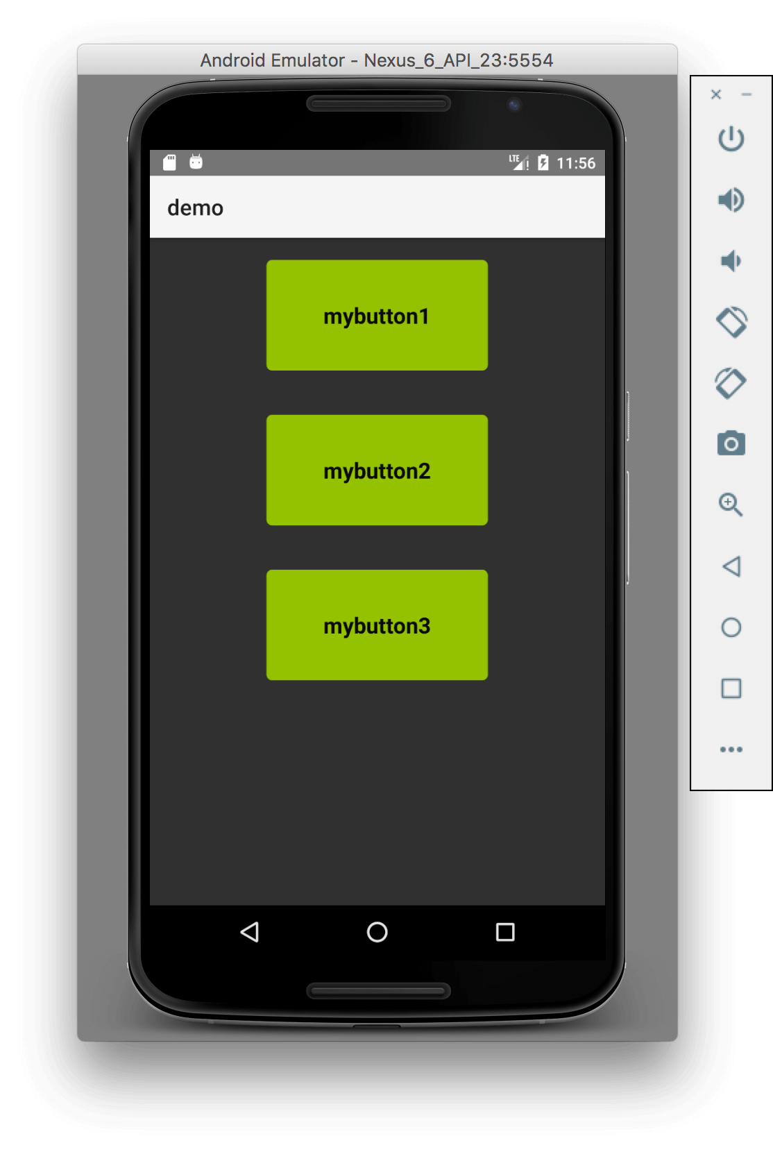
Dark skin on Android
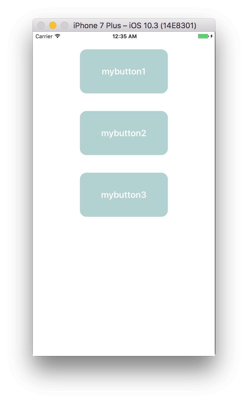
 Dark skin on iOS
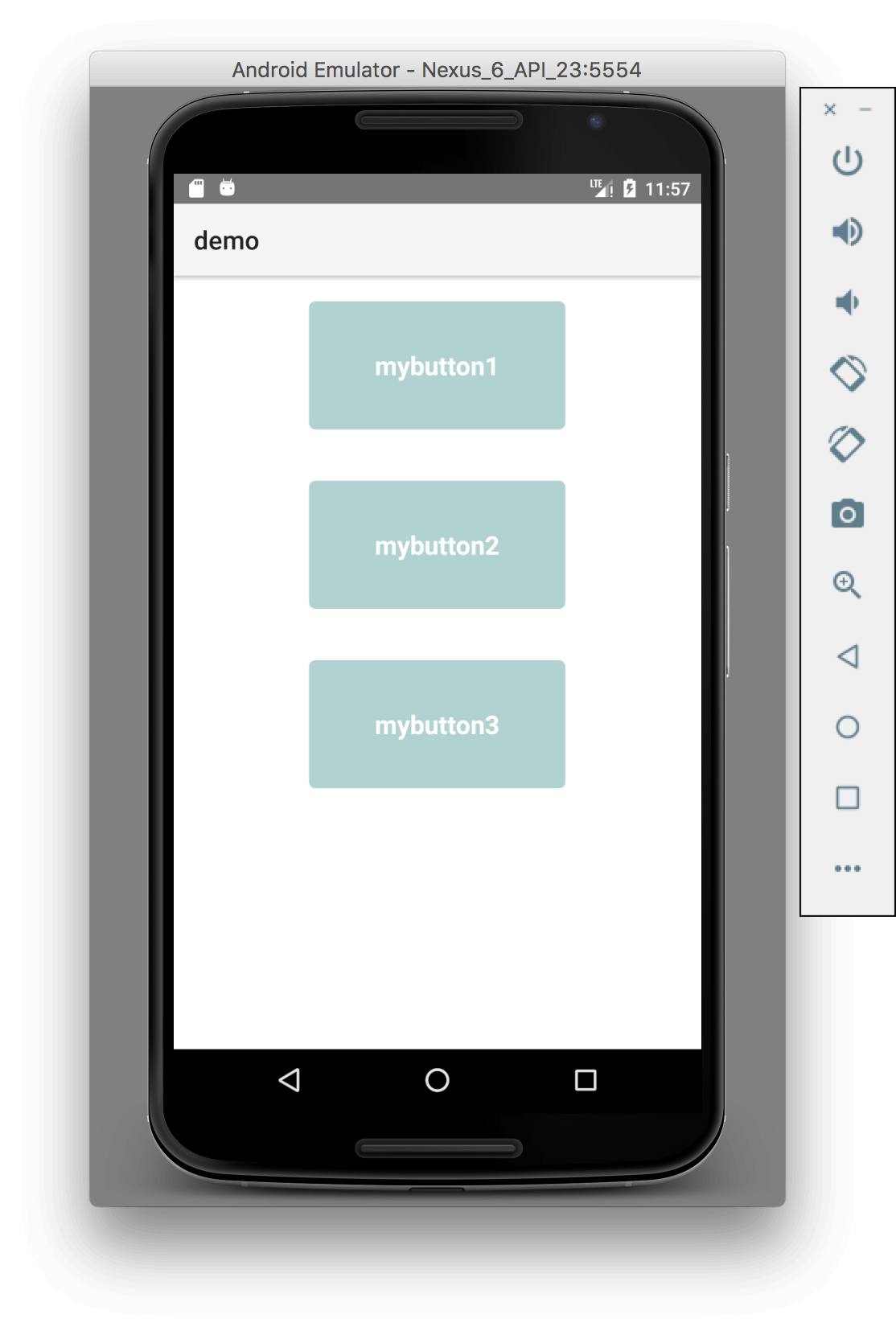
 Light skin on Android
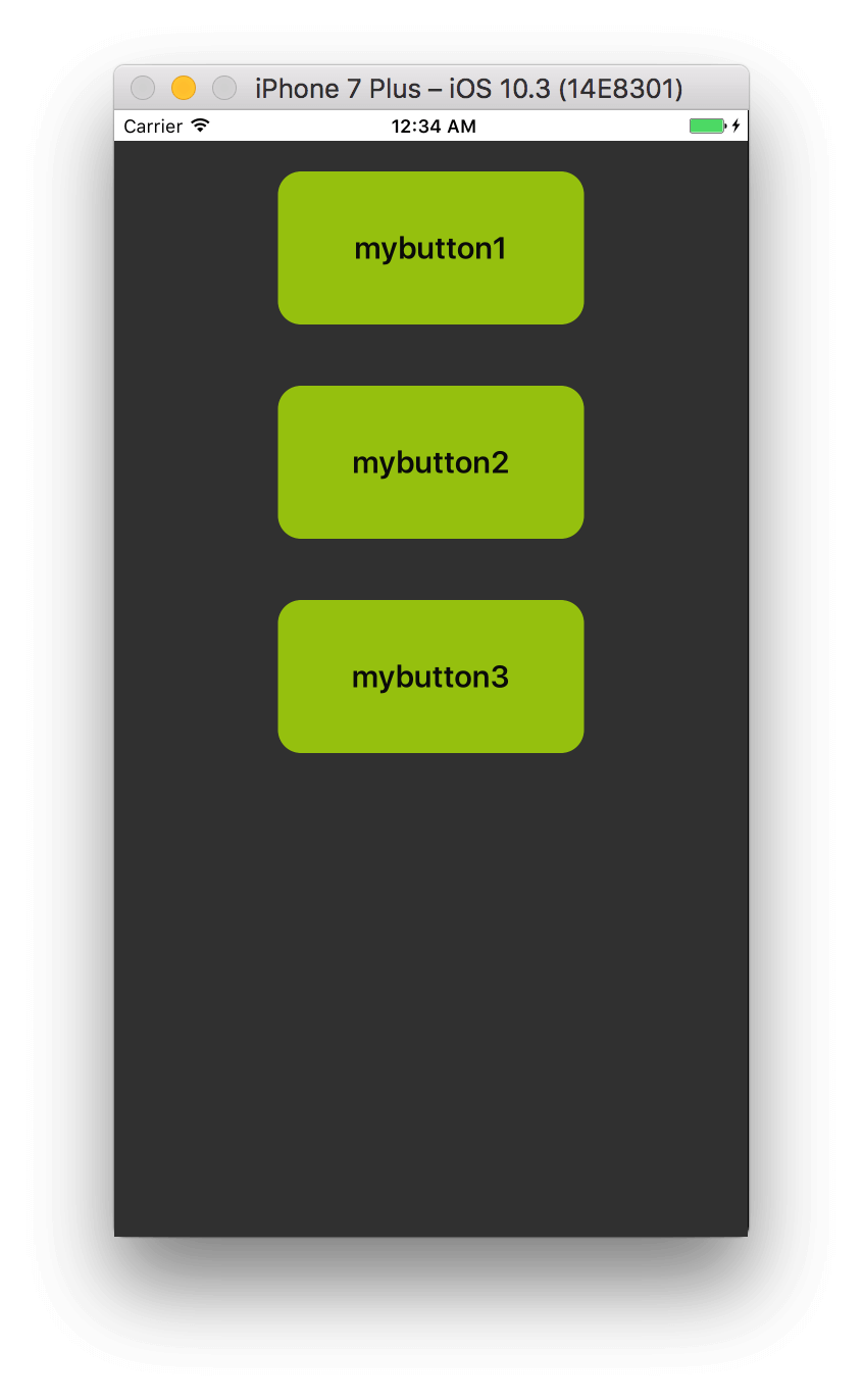
 Light skin on iOS