Chart Getting Started
In this article, you will learn to start using NativeScript UI Chart: how to initialize the chart, how to create the data series and how to use the different axes. The code snippets from this section are available as a standalone demo application.
Plugin Installation
Run the following command to add the plugin to your application:
tns plugin add nativescript-ui-chart
Data Model
Let's start with the DataModel that we will use for our Chart instance. We will create a basic Data Model that will contain a collection of objects, which will have two properties that will be used by the chart to provide intuitive data visualization.
Example 1: Define a source with data
get categoricalSource() {
    return [
        { Country: "Germany", Amount: 15, SecondVal: 14, ThirdVal: 24 },
        { Country: "France", Amount: 13, SecondVal: 23, ThirdVal: 25 },
        { Country: "Bulgaria", Amount: 24, SecondVal: 17, ThirdVal: 23 },
        { Country: "Spain", Amount: 11, SecondVal: 19, ThirdVal: 24 },
        { Country: "USA", Amount: 18, SecondVal: 8, ThirdVal: 21 }
    ];
}
Initialization
Now we can create a new page where we will put the Chart instance. First we will need to ensure that the Chart will be able to show any data, so we will create a page loaded event handler that will set the page's binding context.
Then, in order to add a chart instance in a page of the application, you need to define the following XML namespace:
xmlns:chart="nativescript-ui-chart".
The next step is to add the chart to the page. In this case we will use the RadCartesianChart type. For an example with RadPieChart you can refer to the PieSeries article
Charts must be put in a parent layout panel that does not require from its children to have their own desired size. You should not therefore put your chart in a
StackLayoutor an auto-sized row within aGridLayout.
After adding the chart to the page we need to add the series we
will use in order to show the chart. In this case we will use
the
BarSeries
in combination with a
Categorical axis
and a
Linear axis. We set the categoryProperty of the series to the
Country property in the objects from our data model
and the valueProperty to the
Amount property. Then we set the
horizontalAxis to an instance of a
CategoricalAxis and the
verticalAxis to an instance of a
LinearAxis.
Example 2: Add chart to page's markup
<navigation:ExamplePage xmlns:navigation="navigation/example-page" loaded="onPageLoaded"  xmlns:chart="nativescript-ui-chart" xmlns="http://www.nativescript.org/tns.xsd">
    <chart:RadCartesianChart id="cartesianChart">
        <chart:RadCartesianChart.horizontalAxis>
            <chart:CategoricalAxis/>
        </chart:RadCartesianChart.horizontalAxis>
        <chart:RadCartesianChart.verticalAxis>
            <chart:LinearAxis/>
        </chart:RadCartesianChart.verticalAxis>
        <chart:RadCartesianChart.series>
            <chart:BarSeries items="{{ categoricalSource }}" categoryProperty="Country" valueProperty="Amount"/>
        </chart:RadCartesianChart.series>
    </chart:RadCartesianChart>
</navigation:ExamplePage>
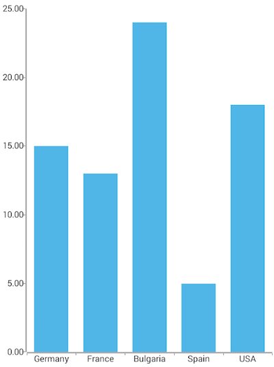
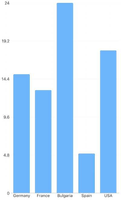
This will produce a page showing a Chart that will look like this:
Figure 1: Chart with BarSeries on Android (left) and iOS (right)


References
Want to see this scenario in action? Check our SDK Examples repository on GitHub. You will find this and many other practical examples with NativeScript UI.
Examples used in this article:
Related articles you might find useful: