User Interface Action Bar
The article describes how to use the ActionBar component in a
non-Angular NativeScript application as well as some iOS and
Android specifics. All described scenarios are demonstrated with
the appropriate code snippet. The ActionBar is the
NativeScript common abstraction over the Android ActionBar and
iOS NavigationBar.
Defining The ActionBar
To define the ActionBar include the ActionBar tag
inside a component template:
<ActionBar title="Custom Title"></ActionBar>
If more than one component defines an ActionBar -
the last definition will be respected. You can also
add items to the current ActionBar.
Note: To hide the ActionBar on the initial page of your Angular application use the
actionBarHiddenboolean property while accesing the currentPageinstance.
Title
Setting The Title Text
Use the title property of the
ActionBar to set the title:
<ActionBar title="Application Title"></ActionBar>
The result is:


Using a Custom Title View
You can set a custom title view, which will render instead of
the title. The example below shows how to combine an image and
label for a titleView (the example contains only
the ActionBar definition):
How to create custom title view instead of the ActionBar title.
<ActionBar title="test">
  <StackLayout orientation="horizontal"
    ios:horizontalAlignment="center"
    android:horizontalAlignment="left">
    <Image src="res://nativescript_logo" class="action-image"></Image>
    <Label text="ativeScript" class="action-label"></Label>
  </StackLayout>
</ActionBar>
.action-image {
    width: 40;
    height: 40;
    vertical-align: center;
}

.action-label {
    color: #3C5AFD;
    font-size: 24;
    font-weight: bold;
    vertical-align: center;
}
The result is:


Note: You can use CSS to style the elements inside the
titleView.
Using Custom View in Action Items
You could set a custom view, which will be rendered instead of the ActionItem text. The example below demonstrates, how to load to separate labels inside the item.
<ActionBar title="Title">
  <ActionItem>
    <StackLayout orientation="horizontal">
        <Label text="Green" color="green"></Label>
        <Label text="Red" color="red"></Label>
      </StackLayout>
  </ActionItem>
</ActionBar>
Important: Platform specific tags (e.g.
<ios>andandroid) can't be used in Angular based project. Use structural directives like*ngIfto create platform specific logic for your ActionBar.
Setting the App Icon for Android
You can set the application icon only for Android. By default,
the application icon is hidden. You can show it by setting the
android.iconVisibility property to
always.
<ActionBar title="App Icon Demo" android.icon="res://icon" android.iconVisibility="always"></ActionBar>
The result is:
![]()
Navigation Button
The NavigationButton component is a common
abstraction over the iOS back button and the Android navigation
button.
<ActionBar title="App Icon Demo">
  <NavigationButton text="Go Back" android.systemIcon="ic_menu_back"
    (tap)="onNavBtnTap()"></NavigationButton>
</ActionBar>
@Component({ ... })
class MyComponent {
    public onNavBtnTap(){
        // This code will be called only in Android.
        console.log("Navigation button tapped!");
    }
}
The result is:


iOS Specifics
The default text of the button is the title of the previous
page; you can change it by setting the
text property as shown in the example
Setting the Text Title. In
iOS, the back button is used explicitly for navigation. It
navigates to the previous page and you cannot handle the
tap event to override this behavior.
If you want to place a button on the left side of the
ActionBar and handle the tap event (e.g., show
slide-out), you can use ActionItem with
ios.position="left".
Android Specifics
In Android, you cannot set text inside the navigation button.
You can use the icon property to set an image
(e.g., ~\images\nav-image.png or
res:\\ic_nav). You can use
android.systemIcon to set one of the system icons
available in Android. In this case, there is no default
behaviour for NavigationButton's tap event, and we
should define manually the callback function, which will be
executed.
Action Items
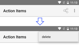
You can define additional action buttons using the
actionItems collection:
<ActionBar title="Action Items">
  <ActionItem (tap)="onShare()"
      ios.systemIcon="9" ios.position="left"
      android.systemIcon="ic_menu_share"
      android.position="actionBar"></ActionItem>
  <ActionItem (tap)="onDelete()"
      ios.systemIcon="16" ios.position="right"
      text="delete" android.position="popup"></ActionItem>
</ActionBar>
@Component({ ... })
class MyComponent {
    onShare(args: observable.EventData) {
        console.log("Share action item tapped.");
    }

    onDelete(args: observable.EventData) {
        console.log("Delete action item tapped.");
    }
}
The result is:


Positioning
The following positioning options are available for iOS and Android.
Android (set with android.position):
-
actionBar[default]: Puts the item in the ActionBar. Action item can be rendered both as text or icon. -
popup: Puts the item in the options menu. Items will be rendered as text. -
actionBarIfRoom: Puts the item in the ActionBar if there is room for it. Otherwise, puts it in the options menu.
iOS (set with ios.position):
-
left[default]: Puts the item on the left side of the ActionBar. -
right: Puts the item on the right side of the ActionBar.
Setting Icons
You can use the icon property to set an image
instead of text for the action item. You can use local image
(e.g., ~/images/add.png) or resource (e.g.,
res://ic_add). Because there is no way to
explicitly set width and height for
icons, the recommended approach is using resources.
You can use the android.systemIcon and
ios.systemIcon properties to show system icons. If
you define a system icon, it will be used instead of
icon and text properties.
Values for android.systemIcon correspond to the
resources names of the built-in Android system icons. For a full
list of Android drawable names, you may visit
Android Developer Site.
Values for ios.systemIcon are numbers from the
UIBarButtonSystemItem
enumeration:
| Value | Icon | Value | Icon | |
|---|---|---|---|---|
| 0 | Done | 12 | Search | |
| 1 | Cancel | 13 | Refresh | |
| 2 | Edit | 14 | Stop | |
| 3 | Save | 15 | Camera | |
| 4 | Add | 16 | Trash | |
| 5 | FlexibleSpace | 17 | Play | |
| 6 | FixedSpace | 18 | Pause | |
| 7 | Compose | 19 | Rewind | |
| 8 | Reply | 20 | FastForward | |
| 9 | Action | 21 | Undo | |
| 10 | Organize | 22 | Redo | |
| 11 | Bookmarks | 23 | PageCurl |
How To
Showing or Hiding the ActionBar
You can explicitly control the visibility of the
ActionBar by setting the
actionBarHidden property of the Page.
You can inject a reference to the current Page in
the constructor of your component using the Angular Dependency
Injection (DI).
import { Component } from "@angular/core";
import { isAndroid, Page } from "@nativescript/core";

@Component({
    selector: "ns-items",
    templateUrl: "./items.component.html",
})
export class ItemsComponent {

    constructor(private page: Page) {
        if (isAndroid) {
            this.page.actionBarHidden = true;
        }
    }
}
In Android, the application bar is visible by default and shows the name of the application as title. The navigation button is visible only when it is explicitly defined in the application.
In iOS, if the application bar is empty (e.g., no title or action items are defined), it is hidden on the first page and automatically shown after navigation to host the navigation button. If the ActionBar is not empty (e.g., there is a title or action items defined) it will be shown on first page, too.
Hiding Action Items
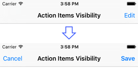
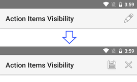
You can use the *ngIf directive to dynamically hide
and show action items.
Here is an example of showing different action items when the app is in "editing" mode:
<ActionBar title="Action Items Visibility">
  <ActionItem *ngIf="!isEditing" (tap)="onEdit()"
    ios.systemIcon="2" android.systemIcon="ic_menu_edit"
    ios.position="right"></ActionItem>

  <ActionItem *ngIf="isEditing" (tap)="onSave()"
    ios.systemIcon="3" android.systemIcon="ic_menu_save"
    ios.position="right"></ActionItem>

  <ActionItem *ngIf="isEditing" (tap)="onCancel()"
    ios.systemIcon="1" android.systemIcon="ic_menu_close_clear_cancel"></ActionItem>
</ActionBar>
@Component({ ... })
class MyComponent {
    isEditing:boolean = false;

    onEdit() {
        console.log("Edit item tapped.");
        this.isEditing = true;
    }

    onSave() {
        console.log("Save item tapped.");
        this.isEditing = false;
    }

    onCancel() {
        console.log("Cancel item tapped.");
        this.isEditing = false;
    }
}
The result is:


Styling
The ActionBar has some CSS styling limitations. You can use only
background-color and color properties.
Here is an example:
<ActionBar title="ActionBar Style">
  <NavigationButton text="Go Back" android.systemIcon="ic_menu_back"></NavigationButton>
  <ActionItem ios.systemIcon="2" android.systemIcon="ic_menu_edit" ios.position="right"></ActionItem>
</ActionBar>
ActionBar {
    background-color:  #3C5AFD;
    color: white;
}
The result is:


In iOS, the color property affects the color of the
title and the action items. In Android, the
color property affects only the title text.
However, you can set the default color of the text in the action
items by adding an actionMenuTextColor item in the
Android theme (inside
App_Resources\Android\values\styles.xml).
Note: Setting other CSS properties (e.g.,
font-family) will only affect the views defined insidetitleView.
Creating SideDrawer Button
This example shows how to implement a "show side-drawer button" functionality.
For Android, this example uses the
NavigationButton because
ActionItems are shown on the right side of the
ActionBar.
For iOS, this code adds a regular ActionItem with
position set to left. Using the
NavigationButton as a side-drawer button in iOS is
not possible, because its function is to always navigate back in
the application.
<ActionBar title="SideDrawer Button">
    <NavigationButton android.systemIcon="res://ic_menu" *ngIf="isAndroid()" (tap)="showSideDrawer()"></NavigationButton>
    <ActionItem ios.systemIcon="res://ic_menu" *ngIf="isIOS()" ios.position="left" (tap)="showSideDrawer()"></ActionItem>
</ActionBar>
import { Component, OnInit } from "@angular/core";
import { isAndroid, isIOS } from "@nativescript/core";

@Component({
    selector: "Home",
    templateUrl: "./home.component.html",
    styleUrls: ['./home.component.css']
})
export class HomeComponent implements OnInit {

    constructor() {
    }

    ngOnInit(): void {
    }

    isIOS(): boolean {
        return isIOS;
    }

    isAndroid(): boolean {
        return isAndroid;
    }

    showSideDrawer(): void {
        console.log("Show SideDrawer tapped.");
        // Show sidedrawer ...
    }
}
ActionBar {
    background-color:  #3C5AFD;
    color: white;
}
The result is:


Adding Actions To Existing ActionBar
Using the ActionBarExtension component you can add
additional action items to the current ActionBar.
This is useful if you are writing a reusable component that
exposes an action (ex. "save"), but you don't want to override
the whole ActionBar.
Here is how to define a contextual copy action:
<ActionBarExtension>
    <ActionItem *ngIf="hasSelection" (tap)="copy()" text="Copy"></ActionItem>
</ActionBarExtension>
@Component({ ... })
class MyTextEditorComponent {
    public hasSelection: boolean;
    // ...
    copy() {
        console.log("Copying...");
        // ...
    }
    // ...
}