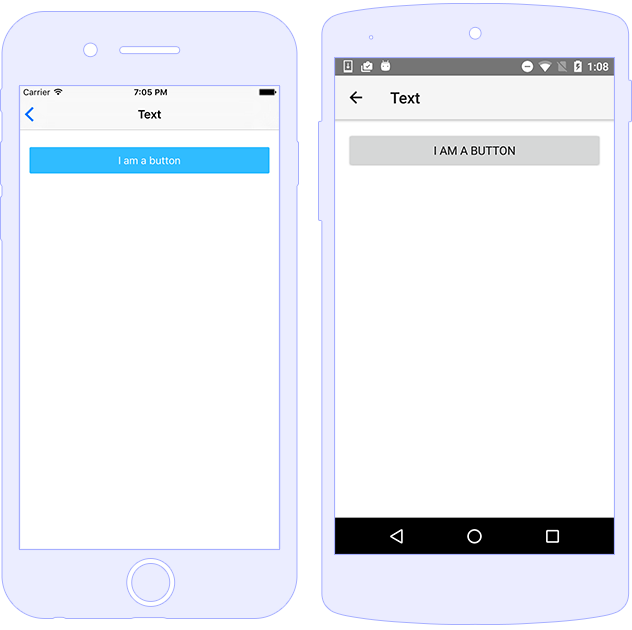
A Button component provides an easy-to-use way for
interacting through the application and invoking custom logic in
response to that. Once the user taps it, the button performs any
actions attached to it.

A Button component can execute custom logic via its
tap event. Handling the event is as easy as using
(tap) in HTML, and implementing a tap handler in
your component.
<Button text="Tap me!" (tap)="onTap($event)"></Button>
onTap(args: EventData) {
    let button = args.object as Button;
    // execute your custom logic here...
}
The Button component can be styled using CSS or
corresponding properties.
<StackLayout>
<!-- No styles applied -->
<Button text="Button"></Button>
<!-- Using local CSS class -->
<Button text=".my-button" class="my-button"></Button>
<!-- Using @nativescript/theme CSS classes -->
<Button text="Button.-primary" class="-primary"></Button>
<Button class="-primary">
<FormattedString>
<Span text="" class="fab"></Span>
<Span text=" Button.-primary with icon"></Span>
</FormattedString>
</Button>
<Button text="Button.-outline" class="-outline"></Button>
<Button text="Button.-primary.-rounded-sm" class="-primary -rounded-sm"></Button>
<Button text="Button.-primary.-rounded-lg" class="-primary -rounded-lg"></Button>
<Button text="Button.-outline.-rounded-sm" class="-outline -rounded-sm"></Button>
<Button text="Button.-outline.-rounded-lg" class="-outline -rounded-lg"></Button>
<Button text="Button.-outline[isEnabled=false]" isEnabled="false" class="-outline"></Button>
<Button text="Button.-primary[isEnabled=false]" isEnabled="false" class="-primary"></Button>
</StackLayout>
.my-button {
    android-elevation: 4;
    background-color: lightseagreen;
    border-color: darkolivegreen;
    border-radius: 20;
    border-width: 1;
    color: whitesmoke;
    font-size: 18;
    font-weight: bold;
}

.my-button:active {
    android-elevation: 8;
    background-color: whitesmoke;
    border-color: darkolivegreen;
    border-radius: 20;
    border-width: 1;
    color: lightseagreen;
    font-size: 18;
    font-weight: bold;
}
| Name |
CSS Name |
Type |
Description |
androidElevation |
android-elevation |
number |
(Android only) Gets or sets the elevation of the android
view.
|
androidDynamicElevationOffset |
android-dynamic-elevation-offset |
number |
(Android only) Gets or sets the dynamic elevation offset
of the android view.
|
| Name |
Type |
Description |
text |
string |
Gets or sets the label of the button. |
| Name |
Description |
tap |
Emitted when the button is tapped. |
loaded |
Emitted when the view is loaded. |
unloaded |
Emitted when the view is unloaded. |
layoutChanged |
Emitted when the layout bounds of a view changes due to
layout processing.
|
