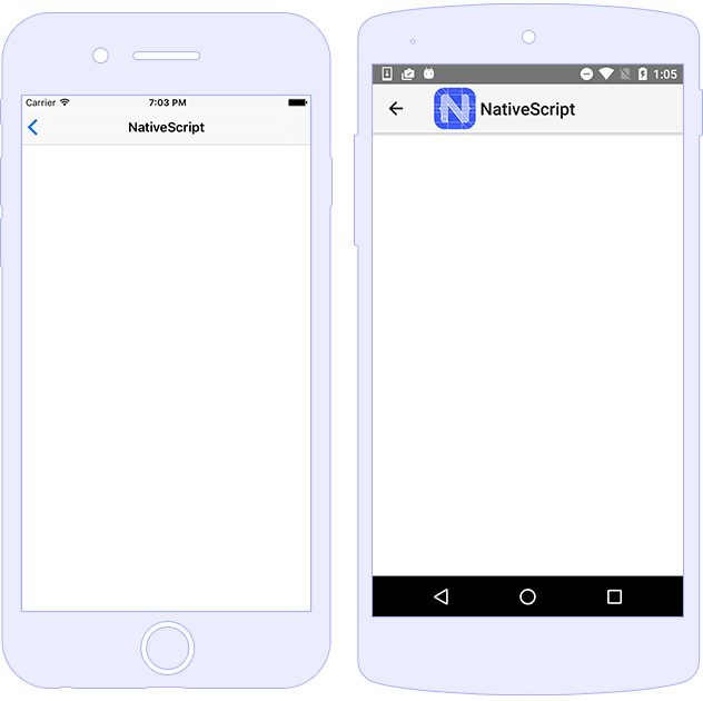
Action Bar
The ActionBar is NativeScript’s abstraction over
the Android ActionBar and iOS
NavigationBar. It represents a toolbar at the top
of the activity window, and can have a title, application-level
navigation, as well as other custom interactive items.

Usage
The ActionBar provides a
title property and can be extended by using one or
more ActionItem components and a single
NavigationButton.
<ActionBar title="ActionBar Title">
<NavigationButton icon="res://ic_arrow_back_black_24dp" (tap)="goBack()"></NavigationButton>
<ActionItem icon="font://" class="fas" ios.position="right" (tap)="openSettings()"></ActionItem>
</ActionBar>
import { Component } from "@angular/core";
import { RouterExtensions } from "nativescript-angular/router";

@Component({
    moduleId: module.id,
    templateUrl: "./usage.component.html"

})
export class ActionBarUsageComponent {

    constructor(private routerExtensions: RouterExtensions) { }

    goBack() {
        this.routerExtensions.backToPreviousPage();
    }

    openSettings() {
        // implement the cusotm logic
    }
}
ActionItem
The ActionItem components are supporting the
platform-specific position and
systemIcon for iOS and Android.
<ActionBar title="Action Items">
    <ActionItem (tap)="onShare()" ios.systemIcon="9" ios.position="left"
                android.systemIcon="ic_menu_share" android.position="actionBar">
    </ActionItem>
    <ActionItem text="delete" (tap)="onDelete()"
                ios.systemIcon="16" ios.position="right" android.position="popup">
    </ActionItem>
</ActionBar>
-
Android sets position via
android.position:-
actionBar: Puts the item in theActionBar. Action item can be rendered both as text or icon. -
popup: Puts the item in the options menu. Items will be rendered as text. -
actionBarIfRoom: Puts the item in theActionBarif there is room for it. Otherwise, puts it in the options menu.
-
-
iOS sets position via
ios.position:-
left: Puts the item on the left side of theActionBar. -
right: Puts the item on the right side of theActionBar.
-
NavigationButton
The NavigationButton component is a common
abstraction over the iOS back button and the Android navigation
button.
iOS Specifics: The default text of the navigation button is the title of the previous page. In iOS, the back button is used explicitly for navigation. It navigates to the previous page and you can't handle the tap event to override this behavior. If you want to place a button on the left side of the ActionBar and handle the tap event (e.g., show slide-out), you can use ActionItem with
ios.position="left".Android Specifics: In Android, you can't set text inside the navigation button. You can use the icon property to set an image (e.g.,
~\images\nav-image.pngorres:\\ic_nav). You can useandroid.systemIconto set one of the system icons available in Android. In this case, there is no default behaviour forNavigationButtontap event, and we should define manually the callback function, which will be executed.
Styling
To style the ActionBar, you can use only
background-color and color properties.
Alternatively, you can use @nativescript/theme and
use the default styles for each different theme. The
icon property of ActionItem can use
Icon Fonts with the font:// prefix. By setting up
this prefix, a new image will be generated, which will be set as
an ActionItem's icon resource. While using this
functionality, we need to specify the font-size,
which will calculate the size of the generated image base on the
device's dpi.
<!-- The default background-color and color of ActionBar & ActionItem are set through nativescript-theme (if used)-->
<ActionBar title="Styling">
<!-- Explicitly hiding the NavigationBar to prevent the default one on iOS-->
<NavigationButton visibility="collapsed"></NavigationButton>
<!-- Using the icon property and Icon Fonts -->
<ActionItem position="left" icon="font://" class="fas" (tap)="goBack()"></ActionItem>
<!-- Creating custom views for ActionItem-->
<ActionItem ios.position="right">
<GridLayout width="100">
<Button text="Theme" class="-primary -rounded-lg"></Button>
</GridLayout>
</ActionItem>
</ActionBar>
Note: In iOS, the
colorproperty affects the color of the title and the action items. In Android, thecolorproperty affects only the title text. However, you can set the default color of the text in the action items by adding anactionMenuTextColoritem in the Android theme (insideApp_Resources\Android\values\styles.xml).
Properties
ActionBar Properties
| Name | Type | Description |
|---|---|---|
title |
string |
Gets or sets the action bar title. |
titleView |
View | Gets or sets the title view. When set - replaces the title with a custom view. |
ActionItem Properties
| Name | Type | Description |
|---|---|---|
text |
string |
Gets or sets the text of the action item. |
icon |
string |
Gets or sets the icon of the action item. Supports local
images (~/), resources (res://)
and icon fonts (fonts://)
|
ios.position |
enum: "left", "right"
|
Sets the position of the item (default value is
left).
|
android.position |
enum: "actionBar", "popup",
"actionBarIfRoom"
|
Sets the position of the item (default value is
actionBar).
|
ios.systemIcon |
number |
iOS only Sets the icon of the action item while using UIBarButtonSystemIcon enumeration. |
android.systemIcon |
string |
Android only Sets a path to a resource icon ( see the list of Android system drawables) |
NavigationButton Properties
| Name | Type | Description |
|---|---|---|
text |
string |
Gets or sets the text of the action item. |
icon |
string |
Gets or sets the icon of the action item. |
Events
| Name | Description |
|---|---|
loaded |
Emitted when the view is loaded. |
unloaded |
Emitted when the view is unloaded. |
layoutChanged |
Emitted when the layout bounds of a view changes due to layout processing. |
API References
| Name | Type |
|---|---|
| ActionBar | Module |
| ActionBar | Class |
| ActionItem | Class |
| ActionItems | Class |
| NavigationButton | Class |
Native Component
| Android | iOS |
|---|---|
| android.widget.Toolbar | UIView |
See Also
Detailed documentation article about
ActionBar functionalities.