Building UI Plugins using Composite Components
When writing a plugin that shows some UI, you can take different paths. One of the easiest of them is to use existing {N} components as building blocks for a more complex UI component (composite), i.e. no explicit calls to native APIs. Thus you can even sometimes avoid using platform-specific files (like *.ios.ts, *.android.ts ...).
Bootstrap Your Plugin
First things first - you start off from a regular plugin. You can check the Building Plugins article for reference.
Add UI bits
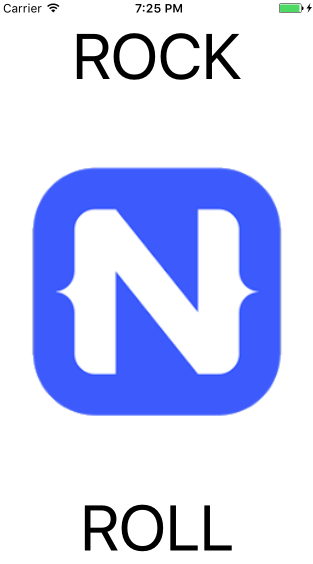
Let's say you want to build a simple meme generator component with three properties, which you can use like:
<ui:Meme imageSource="~/images/nativescript.png" topText="ROCK" bottomText="ROLL" />
...and when used in an app it looks like:
You can implement this by creating two files:
- meme.ts: Contains properties, the implementation logic, and loads the UI.
- meme.xml: Contains the UI and data bindings.
In meme.ts, you need to declare a class with the name of the UI element that will be used in the app:
export class Meme extends GridLayout {
    constructor() {
        super();

        let innerComponent = builder.load(__dirname + '/meme.xml') as View;
        innerComponent.bindingContext = this;

        this.addChild(innerComponent);
    }
}
As you see, in the constructor, we load the UI from the meme.xml and set its bindingContext to this, so that we can bind the XML to the properties:
<GridLayout rows="auto,*, auto">
    <Label row="0" text="" fontSize="64" textWrap="true"
        horizontalAlignment="center" verticalAlignment="top"></Label>

    <Image rowSpan="3" src="" verticalAlignment="stretch"></Image>

    <Label row="2" text="" fontSize="64" textWrap="true"
        horizontalAlignment="center" verticalAlignment="bottom"></Label>
</GridLayout>
The properties themselves are declared and registered in the .ts like:
export const topTextProperty = new Property<Meme, string>({ name: "topText", defaultValue: undefined });
export const bottomTextProperty = new Property<Meme, string>({ name: "bottomText", defaultValue: undefined });
export const imageSourceProperty = new Property<Meme, string>({ name: "imageSource", defaultValue: undefined });

...

imageSourceProperty.register(Meme);
topTextProperty.register(Meme);
bottomTextProperty.register(Meme);
For more details and the full source code of the described meme sample, check the NativeScript ui-plugin sample repo.
Make Your Plugin Angular-Compatible
Having your UI plugin developed successfully you could easily make it Angular-compatible following the steps described in Supporting Angular in UI Plugins article.